GO HERE: http://corwinhersewoo.tumblr.com/
Tuesday, May 20, 2014

Monday, March 4, 2013
UPDATE
Printmouse opened on Friday March 1st and it seemed like the opening was pretty successful even though I wasn't there. Here is the full image of the piece I did for the gallery!

Remember to go here to see what the other contributing artists did.
(and to buy my piece so I get rich).
Tuesday, February 19, 2013
PRINTMOUSE
LISTEN.
Printmouse is an exhibition that features past and present Titmouse artists.
The gallery will feature silkscreen prints by 23 artists one of them being me!
The gallery opens on March 1st and prints will be sold at the gallery and on the website.
here is a taste:

Want to see the whole thing? well check out the gallery if you are in the NY area.
you can also get info on the gallery and see all the artwork at the gallery website here:
You will also be able to view and buy the art there!
I printed an edition of only 50 peices. so, you know... buy one.
also facebook here:

Merry Christmas EunSoo!
Some art I did for EunSoo for a holiday art exchange.
Its kinda weird but whatever I think its alright.

boom.
Thursday, November 8, 2012
cards
Here are 5 different paintings I designed to go on the back of my business cards that I am printing for CTN. Kinda fun.


a diffrent perspective
Here is the perspective sketch that I did for the spaceship hallway piece that is in my portfolio. Ellipses...
dedicated to Aaron.

Saturday, September 22, 2012
another dimension
I want to start practicing some 3d skills.
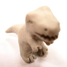
Did this to begin a habit of sculpting practice...
turned out OK i think, although i don't thing a single picture exists where he is not wearing his glasses so the eyes were tough.

Long live the President!
Thursday, September 13, 2012
New Portfolio Site!!!
ATTENTION!!!
that's right,
a NEW website!
I used to have my portfolio posted up on blogger,
But now I have a new site
with my own domain name!
corwinhersewoo.com
GO THERE.
It is way better than the one on blogger.
I am going to take that one down.
good bye.

Sunday, July 8, 2012

Tuesday, November 9, 2010
I did this wall size drawing of a tree in chalk about a week ago. I have never done anything in chalk pastel before but man I loved doing this. This drawing made me want to work HUGE for the rest of my life. It is so much more entertaining to work big. Anyway, managing darker colors and getting really subtle neutral hues was kind of a challenge that seems to just come with chalk I guess but working within the limited palette of the chalk really taught me a lot more about color.


Monday, October 25, 2010
EMAIL CHANGE!!!!!!!!!!!!
for all out there who are curious my email address is now CorwinHW@Gmail.net. NOT CorwinHW@sbcglobal.net because att bought.. yahoo, um, or something.. the name got changed and yahoo sucks. If you still want to use any old address that is fine also.
Also since I have not posted anything in a very long long time, here is a frying pan and a cup I painted digitally. Pretty quick stuff:


Also since I have not posted anything in a very long long time, here is a frying pan and a cup I painted digitally. Pretty quick stuff:


Monday, April 26, 2010
Brian McDonald
It has been a while since posting anything but this weekend master of story Brian McDonald came for a 6 hour lecture on writing story. It was fantastic; one of the most educational six hours I have spent in a very long time. Anyone who wants to write should follow the link to his blog (Sabir, Omar, this means you). just click his name. Here is the sketchbook spread of notes I took throughout the lecture:

Saturday, February 20, 2010
The Animation Sketchbook
Check it out! this is a short animation that my class was challenged to do at the beginning of the semester. the film was required to be about anything you wanted and whatever length you could get away with. as long as it was not porn. Despite those pretty suffocating requirements I did manage to come up with something I think is at least interesting. Its a pretty weird 33 second animation with a very loose narative and some cool visuals; just the sort of shallow mindlessness I am known for.
Enjoy.
Monday, January 11, 2010
INTUOS FOOOOOOOOOOUR!!!!!
YES! I got the new Intuos4 for Christmas and am really exited to start digital painting. Here is a quick something I whipped up to begin familiarizing my self with photoshop. From life.

1:03 - see what I mean?
Merry Christmas!

A painting done for a Christmas art exchange organized thanks to Kristina Wayte. The painting is for Yung-Han Chan. Merry Christmas Yung-Han!! As you can see this painting is very weird and confusing.


Forest Project
The three final products of one very educational semester. For our audiences not acquainted with the assignment, three paintings were to be made based on forests in each of three different Shakespeare plays each with three distinct moods. They were Macbeth, As You Like It, and A Midsummer Nights Dream.

Burnam wood
I really like this one because it is the closest to the original shape comp that I did. Really did a lot of research on the particular textures for this painting because of the crowded foreground.

I think 99% of everybody says this one is their favorite. I don't really see why but my eyes have been dulled from staring at these things for weeks. I do like the colors in the background a lot.

nameless mystery forest
I tried really hard to get a particular ambiance and sense of place in this piece though I had to fight through some barriers like a clunkier composition. My favorite concept of the three.
I am pretty happy with how things turned out here over all. I tried really hard to use (and maybe abuse) the sense of space in the three paintings so that they were notably different locations. I tried my best to push color as far as I could though I think there are still places to work on. I do wish I worked in color pallets for each that were more dissimilar as there are a lot of greens and golds in all three but I think the color was used differently enough to really define the different moods.
(also these are photographs of the paintings so some of the colors and blacks look weird despite a run through in photoshop)
Tiger Style
Various gesture sketches, drawings and studies of tigers and tiger parts.
I may have slipped a lion or cougar head in there.
Go team Big Cats!!

Subscribe to:
Posts (Atom)